PUBLIC ACCESS
ECONOMIC
CONTACT
Sign Up
Log In
Economic Service
|
Insights Hub
Insights Hub
Articles
Economic updates
Videos
Reports
Newsletter
Indicators
Forecasts
National Economic Outlook
Update calendar
Select page
Insights Hub
Articles
Economic updates
Videos
Reports
Newsletter
Indicators
Forecasts
National Economic Outlook
Update calendar
Articles
Series
Topic
Product
From
To
Premium
10 articles found for
David Friggens
10 per page
December 2024
Analysis
2024 Year in Review
Analysis
2024 Year in Review
2024 has been a challenging year for the economy, and although Infometrics has been sailing the same choppy waters as our clients, we’d like to focus on the positives as we pause for the summer break and reflect on the past 12 months.
Wed 18 Dec 2024
David Friggens
🕓 3 min
August 2024
Chart of the month
Rental unaffordability catch up
Chart of the month
Rental unaffordability catch up
Despite being a relatively small country internationally, New Zealand is geographically diverse enough that there is never a single economic "story". One example of this can be seen if we divide the country up into "Metro", "Provincial" and "Rural" areas and examine rental affordability.
Wed 28 Aug 2024
David Friggens
🕓 2 min
November 2021
Chart of the month
A Month of Maps
Chart of the month
A Month of Maps
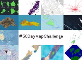
This month I’ve been participating in the #30DayMapChallenge – an informal event organised online for geospatial and cartographic enthusiasts to learn, practice and “have fun”. There are 30 daily prompts to inspire, and anyone who wants to can just post to their preferred social media platform (eg Twitter, Instagram, …) with the hashtag. It’s a great opportunity to get creative and try new things, without the pressure to fully polish the outputs before sharing.
Tue 30 Nov 2021
David Friggens
🕓 12 min
April 2021
Chart of the month
Month of the Chart
Chart of the month
Month of the Chart
Usually in our monthly newsletter we feature a single “chart of the month”, but this time we are featuring April as the “month of the chart” and making a chart for each day. Cédric Scherer and Dominic Royé have organised the #30DayChartChallenge on Twitter, inspired by the success of the similar #30DayMapChallenge, as a chance … Read more Month of the Chart
Thu 29 Apr 2021
David Friggens
🕓 6 min
May 2020
Chart of the month
(Ch)Art of the Month: Data into Art
Chart of the month
(Ch)Art of the Month: Data into Art
One of the great things about working at Infometrics is the view of Wellington Harbour from our office window. Unfortunately, I haven’t seen it for over two months, and don’t expect to for a little while longer. So I thought I’d cheer myself up by recreating it in a scatterplot – more Art than Chart!
Tue 26 May 2020
David Friggens
🕓 1 min
April 2020
Chart of the month
COVID-19 Infections
Chart of the month
COVID-19 Infections
New Zealand has almost completed a month of Level 4 lockdown, aimed at halting the spread of COVID-19. And it seems to be working! New Zealanders have endured incredibly tough restrictions, including requirements to stay home, as well as increased risks for essential workers as they ensured that New Zealand remained fed and looked after.
Tue 21 Apr 2020
David Friggens
🕓 3 min
February 2020
Analysis
Auckland is still big
Analysis
Auckland is still big
Back in August we noted that Auckland city (the urban area defined by Stats NZ) has as many people as the next 12 cities combined. We also showed a map dividing Auckland up into 12 areas with equivalent populations to the cities. Unfortunately, the map is now out of date as Stats NZ revised their population estimates in October.
Tue 25 Feb 2020
David Friggens
🕓 21 min
November 2019
Chart of the month
Local election turnout zigs and zags
Chart of the month
Local election turnout zigs and zags
Every time we have local elections there is lots of talk about the low levels of turnout, and rightly so. In 2016, turnout was up nationally to an unimpressive 42%. The 2019 preliminary results from Local Government NZ show a drop in national turnout to 41.4%. At a slightly more detailed level, “metro” council areas followed a similar zigzag of up in 2016 and down in 2019. Interestingly “provincial” and “rural” council areas showed an inverse zigzag, with decreased turnout in 2016 and increased turnout in 2019.
Tue 12 Nov 2019
David Friggens
🕓 1 min
August 2019
Chart of the month
Auckland is big
Chart of the month
Auckland is big
We know that Auckland is a big part of the country’s economy. In 2018 it had 35% of the population, 36% of the jobs, and accounted for 38% of GDP – up from 31%, 32% and 34% respectively in 2000. But just how big is that really?
Wed 28 Aug 2019
David Friggens
🕓 2 min
April 2019
Chart of the month
Muslim migration is relatively small
Chart of the month
Muslim migration is relatively small
Immigration is a tricky topic when we can’t agree on the numbers, and aside from that is an evergreen political hot potato. Among many legitimate concerns and disagreements, New Zealand has to contend with Islamophobic arguments despite levels of migration being relatively low.
Wed 24 Apr 2019
David Friggens
🕓 1 min
10 per page